Theme & Appearance
The Theme page is where you give your assistant its visual identity — name, avatar, brand colors — and pick the channels where it will live. Everything is previewed live in the page itself, so you can iterate without leaving the dashboard.
Make your AI agent LOOK on-brand · Theme + GDPR widget
→ Admin path: Customization → Theme (/admin/chatModel/{id}/settings/theme)
What you configure
The page is organized as three steps. You can move forward and back at any time; changes in step 2 are saved when you hit Save & Next.
Step 1 — Identity
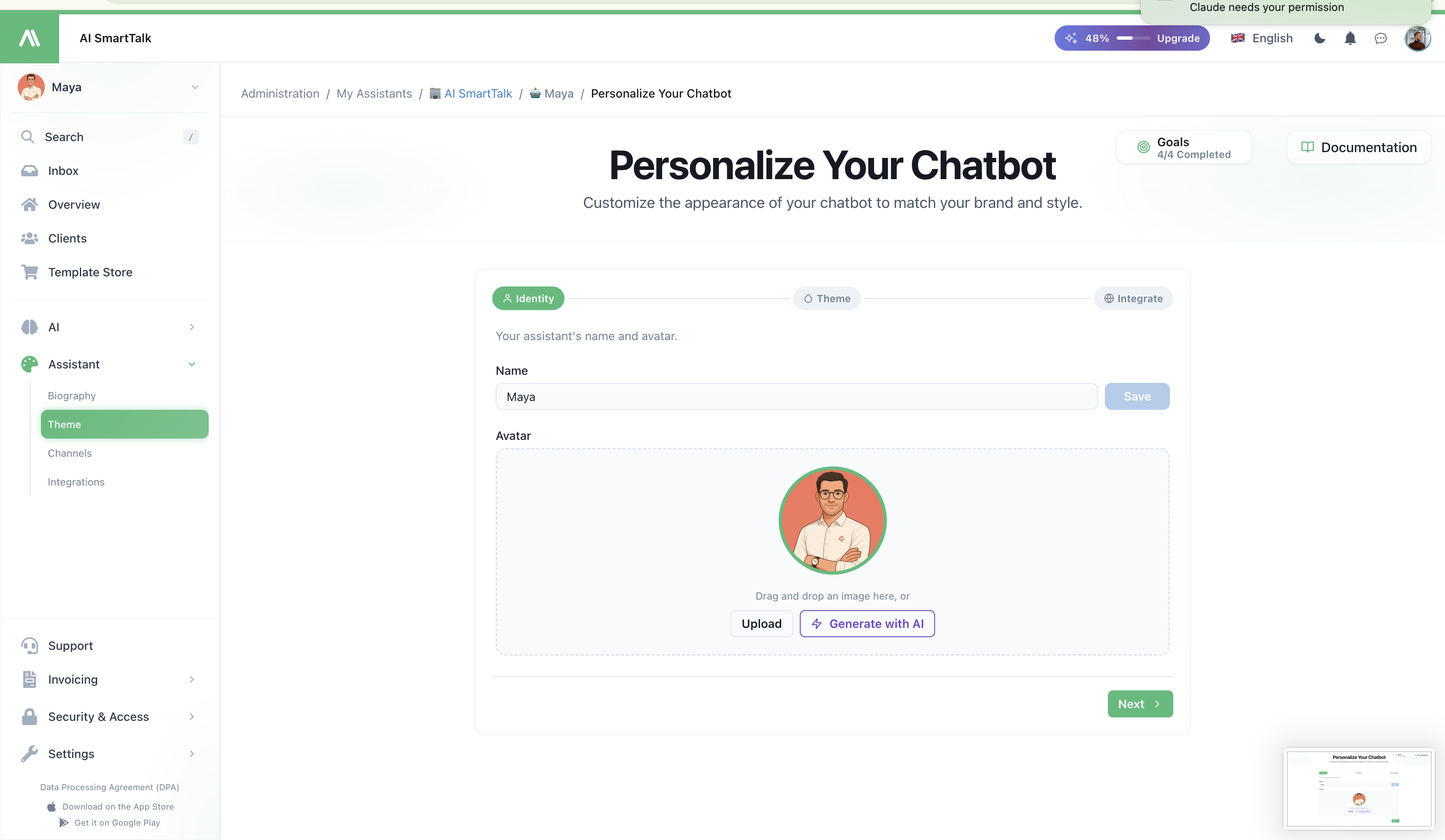
- Name — the public name of your assistant (e.g. "Emma", "Support Bot"). Visible everywhere your assistant talks to users.
- Avatar — the image users see in the chat header and message bubbles. Upload a square image; we resize and serve it from our CDN.
The name is what your users address the bot as. Pick something on-brand and easy to type — it becomes the assistant's identity across every channel.
Step 2 — Colors
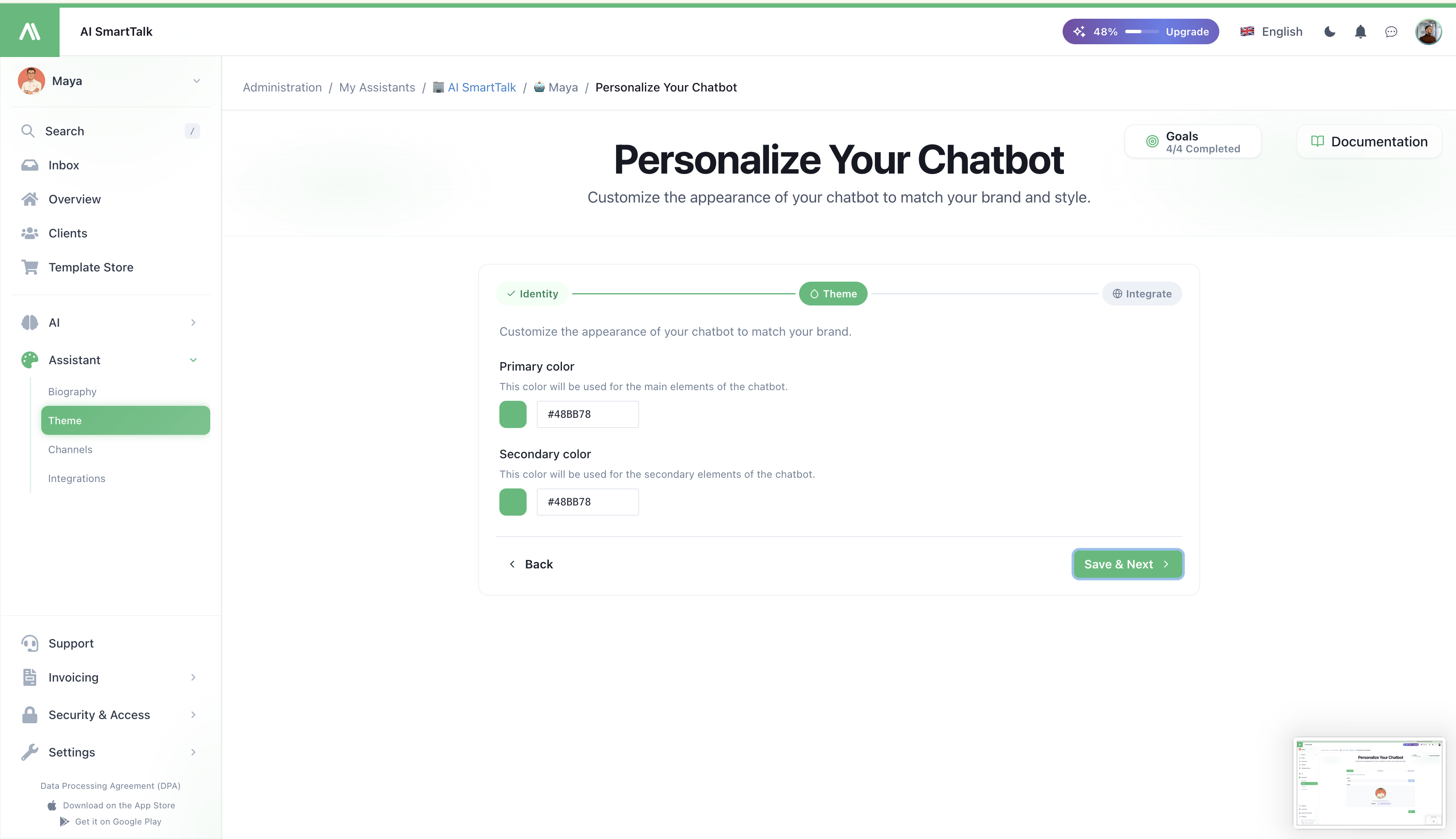
Two colors define the entire widget palette:
| Color | Where it shows |
|---|---|
Primary (brand.200) | Background of the floating button, message bubble accents, hover states |
Secondary (brand.500) | Send button, links inside the conversation, focus rings, active states |
Both inputs accept any HEX value. The live preview at the bottom of the page reflects your changes in real time so you can pick a pair that reads well on your site before saving.
Why only two colors? Our design system derives a full 5-step palette (100/200/500/700/900) from these two anchors. You set the tone; we keep the rest consistent.
Step 3 — Integrate
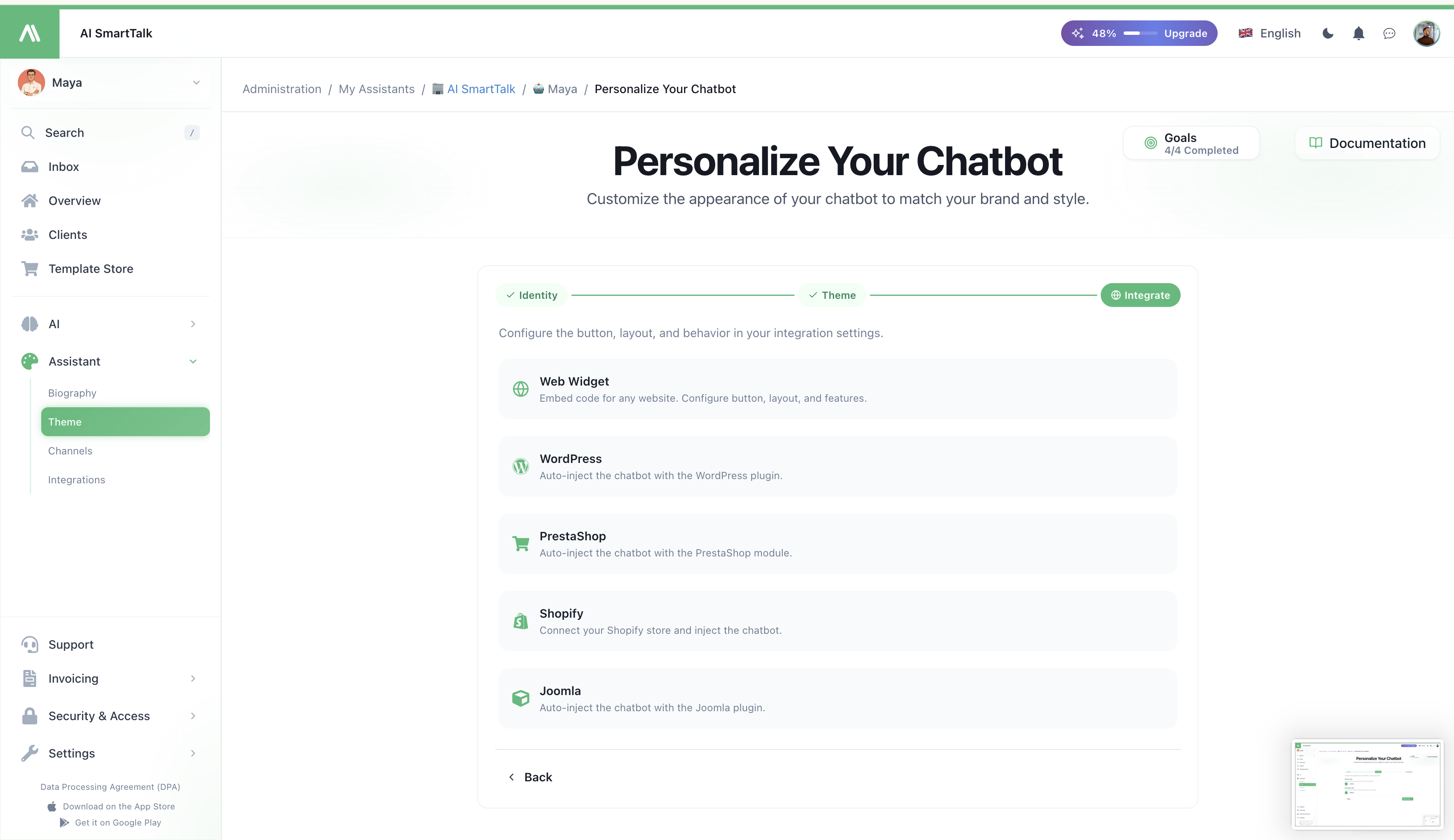
Once your assistant looks right, jump straight to the integration channel of your choice:
- Web Widget — embed code for any website, with full button and layout controls
- WordPress — auto-injection via the WordPress plugin
- PrestaShop — auto-injection via the PrestaShop module
- Shopify — connect your store and inject the chatbot automatically
- Joomla — auto-injection via the Joomla plugin
Each card takes you to the dedicated integration page where you tune button style, position, feedback mode, voice features, and channel-specific behavior.
Live preview
A live chat widget is rendered on the Theme page itself. It re-injects automatically every time you change a color, so you see the exact rendering your end users will get — no need to publish or open another tab.
The preview uses the same universal-chatbot.js bundle as production, so what you see is what your visitors will see.
Permissions
| Action | Required permission |
|---|---|
| View the Theme page | THEME_READ |
| Change colors / save theme | THEME_UPDATE |
| Rename the assistant | CHAT_MODEL_UPDATE |
Members without THEME_UPDATE see the page in read-only mode (inputs disabled, no Save button). See Access Control for how to assign these.
Tips
- Test on your real background. Open your site in a second tab while picking colors — what looks fine in the dashboard may clash with your hero section.
- Keep contrast. The secondary color is also used for clickable text in the conversation. If users can't read it, they won't click.
- Match your CTA, not your logo. The widget is an interactive surface, so anchor it to the action color of your site (the "Buy now" / "Sign up" tone) rather than your logo color.
- Avatar matters more than you think. A real face or a stylized character converts better than a generic robot icon — users open the chat more when it looks human.
Related
- Biography — define your assistant's personality and decision rules
- Integrating the Chatbot — embed it on a website
- Channels — connect messaging platforms
- Access Control — manage who can edit the theme